Charts and graphs
Charts and graphs help users understand data quickly.
About this guidance
This guidance helps teams choose and design charts and graphs that communicate data clearly and consistently across NSW digital products. This guidance was previously titled ‘Data visualisation’. The rename to ‘Charts and graphs’ aligns with the NSW Brand Toolkit and reflects the current scope of this guidance.
It covers common chart types used in services and dashboards, including bar charts, line charts, scatter plots and similar formats. The guidance is tool-agnostic and applies regardless of charting library or platform.
It sets shared principles for clarity, accessibility and consistency rather than prescribing exact implementation. Teams using custom visualisation tools such as D3 should apply the same principles to ensure charts remain understandable and accessible.
Out of scope
- Expressive infographics designed for campaigns or marketing
- Advanced analytical visualisations such as network graphs or complex relationship mapping
- Interactive GIS mapping
- Highly specialised investigative tools built for internal compliance work
These use cases may require bespoke design and technical decisions beyond the scope of the design system. Future guidance may expand to cover additional visualisation types as needs mature.
Principles
These principles apply to all charts and graphs in NSW digital products.
Every chart communicates something. Be clear on what that is before you choose how to show it.
Use honest scales, meaningful baselines and clear labels. Let the data speak for itself.
Remove anything that doesn’t help the reader get to the insight faster. If a chart is trying to say everything, it ends up saying nothing.
Ensure sufficient colour contrast, label data directly where possible, and always provide a text or table alternative.
Use the approved palette, typeface and spacing so charts feel recognisably NSW Government.
Set up your charting tool to enforce accessibility, clarity and brand from the start.
1. Start with the story, not the chart
Each chart type is designed to reveal a specific kind of relationship in data, and choosing the wrong one obscures the message rather than clarifying it.
The most common relationships are comparison and ranking, trend, proportion, distribution and correlation.
You may not need a chart at all. If a single number tells the story, use a callout value. If users need precise figures, use a table. Only use a chart when the visual pattern adds meaning the data alone cannot.
Chart examples on this page use Chart.js but the guidance applies regardless of which charting library you use.
For additional chart relationships and examples, refer to the Financial Times Visual Vocabulary.
- Comparing categories
- Showing change over time
- Showing distribution
- Showing correlation between variables
- Helping users quickly see patterns or trends
- A single number communicates the message
- A table is clearer
- The dataset is too small
- The chart requires heavy explanation
- It is used for decoration
Comparison and ranking
Bar (vertical)
The default choice for comparing value across categories. Switch to horizontal bars if category labels are long.
Summary: City of Sydney and Parramatta assessed the highest number of applications in Q1 2025, together accounting for over a third of the total.
| Local government area | Applications assessed |
|---|---|
| City of Sydney | 312 |
| Parramatta | 284 |
| Blacktown | 251 |
| Liverpool | 198 |
| Penrith | 176 |
| Camden | 143 |
Source: NSW Planning Portal. Last updated: March 2025.
Bar (horizontal)
Use when showing a ranked list, or when category labels are too long to read on a vertical chart.
Summary: Rental Assistance for Vulnerable Households received the largest allocation, at nearly three times the funding of the smallest programme.
| Programme | Funding ($M) |
|---|---|
| Rental Assistance for Vulnerable Households | 48.2 |
| Small Business Digital Transformation Grant | 31.6 |
| Regional Infrastructure Maintenance Program | 27.4 |
| Early Childhood Development Support Initiative | 22.8 |
| Aboriginal Community Housing Improvement Fund | 18.3 |
| Domestic Violence Crisis Response Program | 14.7 |
Source: Service NSW. Last updated: June 2025.
Stacked bar
Shows the composition of a whole across categories, making it easy to spot differences in the mix. Keep segments to three or four and label clearly.
Summary: Digital contact grew steadily across all four quarters, while phone and in-person volumes declined. By Q4, digital accounted for more than two-thirds of all requests.
| Quarter | Phone | Digital | In person |
|---|---|---|---|
| Q1 | 4,200 | 5,800 | 1,100 |
| Q2 | 3,900 | 6,400 | 980 |
| Q3 | 3,600 | 7,100 | 890 |
| Q4 | 3,200 | 8,200 | 760 |
Source: Service NSW. Last updated: June 2025.
Grouped bar
Compares two or more series side by side within each category, making it easy to see differences between series at a glance.
Summary: Approval rates were consistent across all categories, ranging from 87% to 89%. Building contractor licences had the highest volume overall.
| Licence category | Lodged | Approved |
|---|---|---|
| Contractor licence -- building | 1,840 | 1,620 |
| Contractor licence -- electrical | 1,210 | 1,090 |
| Supervisor certificate | 980 | 870 |
| Tradesperson certificate | 760 | 690 |
| Owner-builder permit | 430 | 380 |
Source: NSW Fair Trading. Last updated: June 2025.
Trends over time
Line
The standard choice for showing change over a continuous time period. Use multi-line when you need to compare more than one series.
Summary: Incidents were highest in summer months, peaking in December and January. July recorded the lowest monthly total for the year.
| Month | Incidents |
|---|---|
| January | 3,240 |
| February | 2,980 |
| March | 3,100 |
| April | 2,760 |
| May | 2,640 |
| June | 2,580 |
| July | 2,490 |
| August | 2,520 |
| September | 2,710 |
| October | 2,890 |
| November | 3,040 |
| December | 3,380 |
Source: Transport for NSW. Last updated: December 2024.
Multi-line
Compares how multiple series trend over the same time period. Works best with three or four series. Beyond that, patterns become difficult to separate.
Summary: App transactions grew fastest over the year, nearly doubling. Web remained the largest channel. Assisted digital declined steadily as self-service adoption increased.
| Period | Web | App | Assisted digital |
|---|---|---|---|
| Jul 2024 | 42,000 | 18,000 | 6,200 |
| Jan 2025 | 48,000 | 24,000 | 5,400 |
| Jun 2025 | 51,000 | 31,000 | 4,100 |
Source: Service NSW. Last updated: June 2025.
Area
Shows cumulative volume or share building over time. Use sparingly as a line chart is usually clearer for non-cumulative data.
Summary: Grant disbursements accelerated from October, with the final quarter accounting for more than half of the full-year total.
| Month | Cumulative total ($M) |
|---|---|
| July | 12.4 |
| August | 28.7 |
| September | 41.2 |
| October | 58.9 |
| November | 74.3 |
| December | 89.1 |
Source: NSW Treasury. Last updated: December 2024.
Lines and bar
Shows two related measures with different units over the same period. Only use this when the relationship between the two measures is the point of the chart.
Summary: Visit volumes and wait times both increased in May and June, suggesting capacity pressure heading into the second half of the year.
| Month | Visits | Average wait time (minutes) |
|---|---|---|
| January | 18,400 | 12 |
| February | 16,200 | 10 |
| March | 19,100 | 14 |
| April | 17,800 | 11 |
| May | 20,400 | 16 |
| June | 21,200 | 18 |
Source: Service NSW. Last updated: June 2025.
Stacked area
Shows how components contribute to a changing total over time. Better than a multi-line chart when the cumulative total is as important as the individual series.
Summary: The total number of open cases grew steadily across all priority levels. Critical cases grew fastest proportionally, nearly doubling between January and June.
| Period | Standard | High | Critical |
|---|---|---|---|
| Jan | 200 | 540 | 80 |
| Feb | 230 | 620 | 90 |
| Mar | 300 | 640 | 95 |
| Apr | 330 | 680 | 120 |
| May | 520 | 690 | 135 |
| Jun | 600 | 700 | 150 |
Source: Service NSW. Last updated: June 2025.
Proportion
Doughnut
Shows simple proportion between two to four segments. The centre space can display a total or key callout value, which makes it a common choice for dashboards. Use a bar chart when precise comparison between segments matters more than showing the whole.
Summary: More than three-quarters of service requests were resolved on first contact in Q2 2025.
| Outcome | Share |
|---|---|
| Resolved on first contact | 78% |
| Escalated | 22% |
Source: Service NSW. Last updated: June 2025.
Pie
Functionally identical to a doughnut but without the centre space. Doughnuts are generally preferred in digital products as the centre can carry additional context.
Summary: Digital channels accounted for the largest share of service requests in Q2 2025, followed by phone and in-person channels.
| Channel | Share |
|---|---|
| Digital | 40% |
| Phone | 25% |
| In person | 20% |
| 15% |
Source: Service NSW. Last updated: June 2025.
Stacked proportional bar (100%)
Compares proportional composition across categories where each bar sums to 100%. Because actual counts are hidden, provide the absolute total for each category so users can judge the scale behind the percentages.
Summary: Resolution rates were highest in Metro and Hunter regions. Western NSW had the lowest resolution rate and the highest escalation rate.
| Region | Resolved (%) | Escalated (%) | Withdrawn (%) |
|---|---|---|---|
| Metro | 74 | 18 | 8 |
| Hunter | 71 | 20 | 9 |
| Illawarra | 68 | 22 | 10 |
| Western NSW | 65 | 24 | 11 |
Source: NSW Fair Trading. Last updated: June 2025.
Distribution and correlation
Scatter plot
Shows the relationship or correlation between two variables across a dataset. Use only when there is a genuine relationship worth showing.
Summary: Applications with higher complexity scores consistently took longer to process. Most straightforward applications (score below 30) resolved within 5 working days. Complex applications (score above 70) averaged 18 days, with significant variation.
| Application | Complexity score | Processing time (days) |
|---|---|---|
| A | 24 | 4 |
| B | 31 | 6 |
| C | 45 | 9 |
| D | 62 | 14 |
| E | 74 | 18 |
| F | 86 | 22 |
Source: NSW Planning Portal. Last updated: March 2025.
Bubble plot
Shows relationship and magnitude across two variables, with bubble size encoding a third dimension. Use only when all three dimensions are meaningful, otherwise a scatter plot is simpler and clearer.
Summary: Higher-complexity applications generally had longer processing times, with the largest application volumes clustered in the mid-complexity range.
| Location | Complexity score | Processing time (days) | Applications |
|---|---|---|---|
| Sydney | 42 | 9 | 480 |
| Parramatta | 51 | 11 | 420 |
| Blacktown | 57 | 13 | 390 |
| Liverpool | 63 | 15 | 350 |
| Penrith | 68 | 17 | 310 |
| Camden | 74 | 19 | 260 |
Source: NSW Planning Portal. Last updated: March 2025.
Vertical dot plot
Shows distribution across categories with less visual weight than bars. A good alternative to a bar chart when showing the spread of individual data points matters as much as the category totals.
Summary: Processing-time variation was widest in the middle of the week. Monday and Friday showed tighter clustering, while Wednesday and Thursday had more spread.
| Weekday | Observed processing times (days) |
|---|---|
| Mon | 4.1, 5.2, 6.0, 7.2 |
| Tue | 5.1, 5.8, 6.5, 7.8 |
| Wed | 6.0, 6.9, 7.6, 8.9 |
| Thu | 5.5, 6.4, 7.0, 8.3 |
| Fri | 4.8, 5.9, 6.7, 7.4 |
Source: Service NSW. Last updated: June 2025.
Histogram
Shows how values are distributed across a continuous numeric range. Use this instead of a bar chart when the data is continuous and the shape of the distribution is the story.
Summary: The majority of calls were handled within 3 to 5 minutes. Calls under 1 minute and over 10 minutes each represented less than 10% of total volume.
| Duration (minutes) | Number of calls |
|---|---|
| 0–1 | 1,840 |
| 1–2 | 3,210 |
| 2–3 | 4,890 |
| 3–5 | 6,120 |
| 5–10 | 3,840 |
| 10+ | 1,100 |
Source: Service NSW. Last updated: March 2025.
Radar
Compares profiles across the same fixed set of dimensions. Use only when the overall shape of the profile matters, as a grouped bar chart or table is clearer when precise values are the priority.
Summary: Metro outperformed Regional on all five dimensions. Accessibility showed the largest gap between the two regions.
| Dimension | Metro | Regional |
|---|---|---|
| Timeliness | 84 | 76 |
| Accuracy | 91 | 88 |
| Satisfaction | 87 | 82 |
| Accessibility | 79 | 71 |
| Resolution rate | 88 | 80 |
Source: Service NSW. Last updated: June 2025.
2. Represent the data honestly
Use honest scales, meaningful baselines and clear labels. Let the data speak for itself.
- Use honest baselines and avoid truncating axes without clear indication.
- Keep time intervals and category order consistent.
- Label clearly so users can read values without guessing.
Column chart starts at 90, labels are rotated and the title does not explain the timeframe.
- Exaggerates differences by truncating the axis.
- Missing units and time period.
- Long labels are hard to read.
Use a horizontal bar chart that starts at zero with direct labels and a clear timeframe.
| Region | Completions |
|---|---|
| Illawarra Shoalhaven | 96 |
| Central Coast | 101 |
| Hunter New England | 98 |
| Western NSW | 104 |
- Set the chart canvas to a white background.
- Start the axis at zero or clearly indicate truncation.
- Include timeframe and unit in the title.
- Keep labels readable and aligned.
Chart anatomy
Every chart must include the core elements required for clarity and accurate interpretation. The title can optionally include either a subtitle or a callout value.
Numbered markers on the chart map to the anatomy list.
Summary: Requests resolved on time increased from January to May 2026, then eased slightly in June. Late resolutions trended down across the same period.
| Month | Resolved on time | Resolved late |
|---|---|---|
| Jan | 410 | 72 |
| Feb | 438 | 68 |
| Mar | 467 | 74 |
| Apr | 492 | 70 |
| May | 525 | 66 |
| Jun | 508 | 61 |
- Title: Use a descriptive title that states what the data represents, and include timeframe and unit where relevant.
- Subtitle (optional): Use a subtitle directly beneath the title to clarify unit, scope or measure. Use either a subtitle or a callout in most cases, not both.
- Callout (optional): Use a callout directly beneath the title to emphasise one key figure. Use either a subtitle or a callout in most cases, not both.
- Axis labels: Label each axis clearly with unit and time interval. Avoid abbreviations that are not widely understood.
- Data labels: Label data directly where practical, especially for bar and column values.
- Legend: Use a legend only when direct labels are not practical. Keep it close to the chart and readable at 200% zoom.
- Scale: Use consistent scales. Start bar charts at zero unless you have a documented reason not to, and indicate any truncation.
- Source and metadata: Include source, last updated date, and any definitions required for interpretation.
- Spacing and alignment: Keep spacing consistent between bars, labels and grid lines so the chart remains scannable.
- Summary text: Include a short plain-language summary of the key insight directly below the chart.
- Data table: Provide a semantic table for the same data so users can access exact values without relying on the visual chart.
3. Make the key insight obvious
Remove anything that doesn’t help the reader get to the insight faster. If a chart is trying to say everything, it ends up saying nothing.
- Limit the number of data series.
- Avoid clutter or unnecessary visual elements.
- Use annotations to highlight the key insight.
Dashboards
- Place key metrics first.
- Group related charts.
- Avoid horizontal scrolling for primary information.
- If metadata applies to all charts, include it at the container level.
4. Meet accessibility standards
Charts must meet WCAG 2.2 AA and AAA where possible. Accessibility is the responsibility of the product team, regardless of which tool or library is used.
Contrast
- Text in charts must meet a minimum contrast ratio of 4.5:1 (WCAG 1.4.3).
- Graphical elements such as bars, lines, data points and focus indicators must meet a minimum contrast ratio of 3:1 against adjacent colours and background (WCAG 1.4.11).
- Test contrast in the rendered environment, not just in design files.
Use of colour
Colour must not be the only way to communicate meaning (WCAG 1.4.1).
When differentiating data series:
- Use direct labels where possible.
- Use different marker shapes or stroke styles.
- Avoid relying solely on red/green distinctions.
- Confirm charts remain understandable in greyscale.
Keyboard access
Interactive charts must support full keyboard operation (WCAG 2.1.1).
- All interactive elements are focusable.
- Logical tab order.
- Visible focus indicators.
- Focus is not hidden or obscured (WCAG 2.4.11).
- Interactive targets are at least 24×24px (WCAG 2.5.8).
- Test keyboard interaction manually.
Text alternatives
Every chart must have a text alternative. Users must be able to access the same information without relying on the visual chart. This includes screen reader users, users who have disabled images, and users in low-bandwidth environments.
Summary text
Write a short summary that captures the key insight in plain language. Place it directly above or below the chart.
A summary is not a description of the chart. Do not write ‘the chart shows a line going up.’ Write what the data means.
- Example: Service requests increased steadily from January to May 2025, rising from 220 to 420. A small drop occurred in June.
Data table
A data table gives users access to to the underlying data. The right approach depends on the complexity of the data set.
- For small datasets, provide a full data table using semantic HTML. Keep it visible on the page. Do not hide it behind a toggle or accordion.
- For medium datasets, a summarised table covering the key values is sufficient.
- For large or complex datasets, a written summary plus a link to download the source data is more useful than a large rendered table.
Alt text for images
If a chart is rendered as a static image, it must have descriptive alt text.
- Alt text should convey the key insight, not describe the visual
- For complex charts, use a short alt text and point to the accompanying table or summary
- Example:
alt=“Line chart showing monthly service applications for January to June 2025. Data in table below”
Zoom and responsiveness
Charts must remain usable at 200% zoom and 375px viewport width
- Labels do not overlap.
- Primary information remains visible.
- Horizontal scrolling does not hide critical data.
Tool limitations
- Some third-party tools may restrict accessibility customisation.
- If a tool cannot meet WCAG requirements, document the limitation and provide an accessible alternative.
- Accessibility responsibility remains with the product team.
5. Apply NSW visual identity consistently
Apply the NSW brand colour and typography with care. Prioritise contrast and readability. Do not use the palette decoratively.
- Use NSW Brand colour and typography intentionally.
Recommended colour selection method
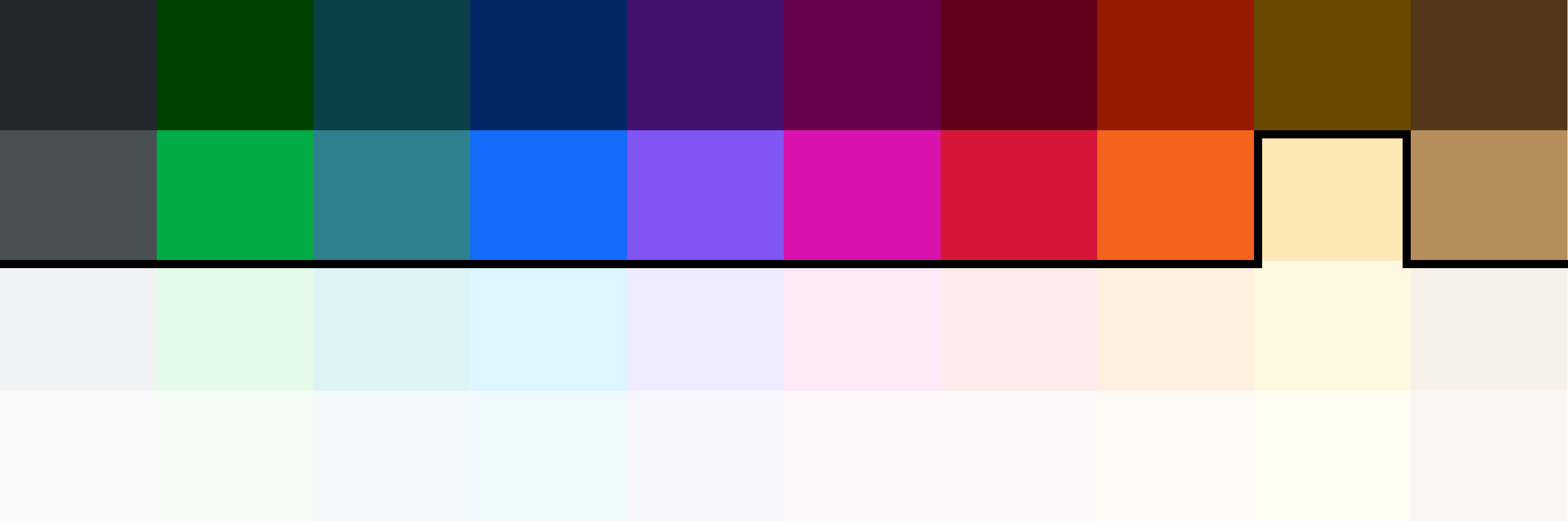
Step 1: Use only approved chart colours
Not all NSW palette colours meet the minimum contrast requirement for chart marks. The colours below have been pre-validated against a white background and are approved for use in charts and graphs.
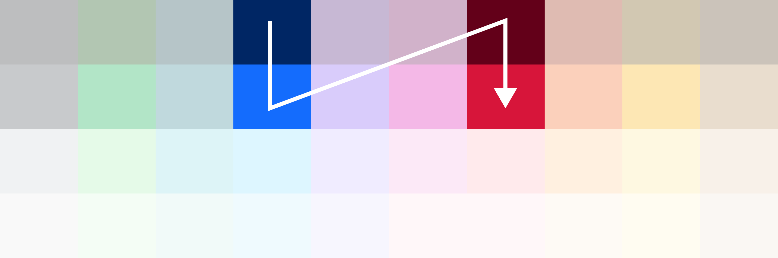
Step 2: Start with your main theme colour 01 and 02
Begin with the 01 and 02 colours from your main colour theme. If your theme is Blue and Red, start with Blue 01, Blue 02, Red 01 and Red 02, in that order.
Starting with your theme colours ensures charts feel consistent with the rest of your digital product before introducing additional colours.
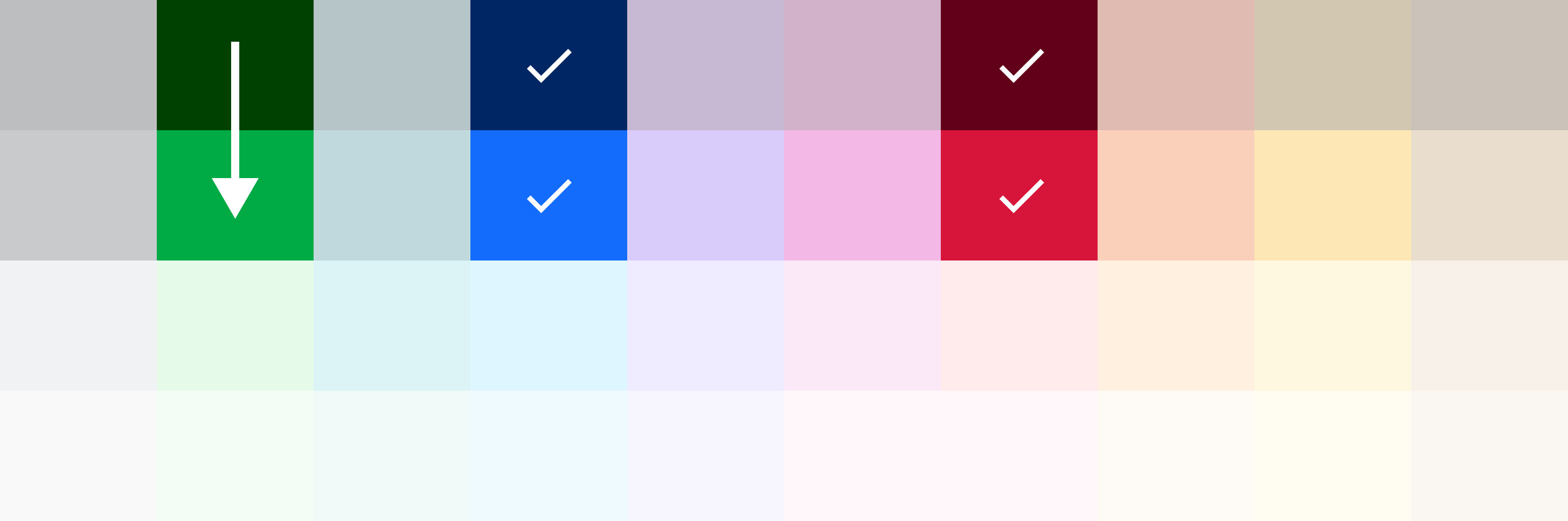
Step 3: Expand to another colour set when needed
Once your main theme colours are used, bring in 01 and 02 colours from another colour column. Apply the same sequence – 01 before 02 – and avoid mixing colours from too many sets in a single chart.
If you find yourself needing more than six to eight colours in one chart, consider whether the data can be simplified, grouped, or split across multiple charts instead.
Respecting established colour conventions
Some data has widely understood colour associations that users rely on to interpret meaning quickly. In these cases, following the established convention takes priority over the standard colour selection method.
A traffic light system is the most common example. Using red for high risk, amber for moderate risk and green for low risk is so broadly understood that departing from it would confuse users, even if those colours are not your primary theme colours.
Other examples include:
- Political representation: established party colours in electoral or parliamentary data
- Environmental indicators: blue for water, green for vegetation in environmental reporting
- Financial conventions: red for negative values, black or green for positive values
When using conventional colours, still meet the 3:1 contrast requirement against white, and support colour with labels, patterns or other markers so the meaning is not lost for users who cannot distinguish the colours.
Do not apply this exception broadly. If there is no established convention that your audience would recognise, use the standard colour selection method.
Background colour
Charts must use a white background (#FFFFFF or --nsw-brand-white) to ensure sufficient contrast for data marks.
NSW Government palette chart-mark options
| Swatch (plain) | Colour value | Contrast ratio on white | Swatch (pattern) | Line value | Pattern contrast |
|---|---|---|---|---|---|
| Blue 01 plain swatch | Blue 01 (#002664) |
14.37:1 |
Blue 01 patterned swatch | Blue 04 (#CBEDFD) |
11.68:1 |
| Blue 02 plain swatch | Blue 02 (#146CFD) |
4.57:1 |
Blue 02 patterned swatch | Blue 04 (#CBEDFD) |
3.72:1 |
| Purple 01 plain swatch | Purple 01 (#441170) |
13.46:1 |
Purple 01 patterned swatch | Purple 04 (#E6E1FD) |
10.61:1 |
| Purple 02 plain swatch | Purple 02 (#8055F1) |
4.68:1 |
Purple 02 patterned swatch | Purple 04 (#E6E1FD) |
3.69:1 |
| Fuchsia 01 plain swatch | Fuchsia 01 (#65004D) |
12.65:1 |
Fuchsia 01 patterned swatch | Fuchsia 04 (#FDDEF2) |
10.18:1 |
| Fuchsia 02 plain swatch | Fuchsia 02 (#D912AE) |
4.52:1 |
Fuchsia 02 patterned swatch | Fuchsia 04 (#FDDEF2) |
3.64:1 |
| Red 01 plain swatch | Red 01 (#630019) |
13.60:1 |
Red 01 patterned swatch | Red 04 (#FFE6EA) |
11.50:1 |
| Red 02 plain swatch | Red 02 (#D7153A) |
5.18:1 |
Red 02 patterned swatch | Red 04 (#FFE6EA) |
4.38:1 |
| Orange 01 plain swatch | Orange 01 (#941B00) |
8.69:1 |
Orange 01 patterned swatch | Orange 04 (#FDEDDF) |
7.60:1 |
| Orange 02 plain swatch | Orange 02 (#F3631B) |
3.18:1 |
Orange 02 patterned swatch | White (#FFFFFF) |
3.18:1 |
| Brown 01 plain swatch | Brown 01 (#523719) |
10.94:1 |
Brown 01 patterned swatch | Brown 04 (#EDE3D7) |
8.63:1 |
| Brown 02 plain swatch | Brown 02 (#B68D5D) |
3.02:1 |
Brown 02 patterned swatch | White (#FFFFFF) |
3.02:1 |
| Yellow 01 plain swatch | Yellow 01 (#694800) |
8.31:1 |
Yellow 01 patterned swatch | Yellow 04 (#FFF4CF) |
7.55:1 |
| Green 01 plain swatch | Green 01 (#004000) |
12.12:1 |
Green 01 patterned swatch | Green 04 (#DBFADF) |
10.82:1 |
| Green 02 plain swatch | Green 02 (#00AA45) |
3.07:1 |
Green 02 patterned swatch | White (#FFFFFF) |
3.07:1 |
| Teal 01 plain swatch | Teal 01 (#0B3F47) |
11.56:1 |
Teal 01 patterned swatch | Teal 04 (#D1EEEA) |
9.43:1 |
| Teal 02 plain swatch | Teal 02 (#2E808E) |
4.57:1 |
Teal 02 patterned swatch | Teal 04 (#D1EEEA) |
3.73:1 |
| Grey 01 plain swatch | Grey 01 (#22272B) |
15.07:1 |
Grey 01 patterned swatch | Grey 04 (#EBEBEB) |
12.64:1 |
| Grey 02 plain swatch | Grey 02 (#495054) |
8.21:1 |
Grey 02 patterned swatch | Grey 04 (#EBEBEB) |
6.88:1 |
In a few 02 rows, the line colour uses White or 01 to keep pattern contrast at or above 3:1.
Aboriginal palette chart-mark options
| Swatch (plain) | Colour value | Contrast ratio on white | Swatch (pattern) | Line value | Pattern contrast |
|---|---|---|---|---|---|
| Earth red plain swatch | Earth red (#950906) |
9.05:1 |
Earth red patterned swatch | Galah pink (#FDD9D9) |
6.94:1 |
| Ember red plain swatch | Ember red (#E1261C) |
4.67:1 |
Ember red patterned swatch | Galah pink (#FDD9D9) |
3.58:1 |
| Deep orange plain swatch | Deep orange (#882600) |
9.04:1 |
Deep orange patterned swatch | Sunset orange (#F9D4BE) |
6.54:1 |
| Orange ochre plain swatch | Orange ochre (#EE6314) |
3.27:1 |
Orange ochre patterned swatch | White (#FFFFFF) |
3.27:1 |
| Bush honey yellow plain swatch | Bush honey yellow (#895E00) |
5.73:1 |
Bush honey yellow patterned swatch | Sunbeam yellow (#FFF1C5) |
5.09:1 |
| Riverbed brown plain swatch | Riverbed brown (#552105) |
13.08:1 |
Riverbed brown patterned swatch | Macadamia brown (#E9C8B2) |
8.32:1 |
| Firewood brown plain swatch | Firewood brown (#9E5332) |
5.62:1 |
Firewood brown patterned swatch | Macadamia brown (#E9C8B2) |
3.58:1 |
| Charcoal grey plain swatch | Charcoal grey (#272727) |
14.94:1 |
Charcoal grey patterned swatch | Smoke grey (#E5E3E0) |
11.66:1 |
| Emu grey plain swatch | Emu grey (#555555) |
7.46:1 |
Emu grey patterned swatch | Smoke grey (#E5E3E0) |
5.82:1 |
| Bushland green plain swatch | Bushland green (#215834) |
8.37:1 |
Bushland green patterned swatch | Saltbush green (#DAE6D1) |
6.46:1 |
| Marshland lime plain swatch | Marshland lime (#78A146) |
3.01:1 |
Marshland lime patterned swatch | White (#FFFFFF) |
3.01:1 |
| Billabong blue plain swatch | Billabong blue (#00405E) |
11.08:1 |
Billabong blue patterned swatch | Coastal blue (#C1E2E8) |
8.08:1 |
| Saltwater blue plain swatch | Saltwater blue (#0D6791) |
6.24:1 |
Saltwater blue patterned swatch | Coastal blue (#C1E2E8) |
4.55:1 |
| Bush plum plain swatch | Bush plum (#472642) |
12.93:1 |
Bush plum patterned swatch | Dusk purple (#E4CCE0) |
8.63:1 |
| Spirit lilac plain swatch | Spirit lilac (#9A5E93) |
4.78:1 |
Spirit lilac patterned swatch | Dusk purple (#E4CCE0) |
3.19:1 |
Aboriginal palette options shown here all meet at least 3:1 contrast on white. Where same-family pairings are too low, white pattern lines are used to maintain compliance.
Using a single colour
Not all charts need multiple colours. Some chart types communicate clearly with a single colour and do not require colour differentiation between categories.
A bar chart comparing values across categories is a good example. Each bar represents a separate category, and the position and length of the bar communicates the difference - not the colour. Using a single colour in this case reduces visual noise and keeps the focus on the data.
Use a single colour when:
- Each bar, column or data point represents a separate category that is already labelled.
- There is only one data series.
- Colour differentiation would add no meaning.
Use multiple colours when:
- Multiple data series appear in the same chart space (for example, a grouped bar or multi-line chart).
- A specific segment or value needs to be highlighted.
- Colour is used alongside other cues to distinguish series.
Colour-blind safety
The most common type of colour vision deficiency is red-green confusion. Avoid placing these colour pairs next to each other:
- Green and brown
- Red and brown
- Purple and blue
Line-series differentiation
For line charts, use dash styles, not fill patterns. Dash patterns (solid, dashed, dotted, dash-dot) are the correct redundant channel for distinguishing line series. Fill patterns are for bar, area and pie/doughnut chart marks only.
| Style swatch | Name | Use |
|---|---|---|
| Solid line style | Solid | Primary series |
| Dashed line style | Dashed | Secondary |
| Dotted line style | Dotted | Tertiary |
| Dash-dot line style | Dash-dot | Quaternary |
Using patterns
Colour is usually the primary cue for distinguishing datasets, but charts must remain understandable when users cannot rely on colour alone.
- Use two colours per pattern: a fill and a pattern stroke.
- Keep at least
3:1contrast between fill and pattern stroke. - Use colours from the same palette column where possible (for example, Blue 03 fill with Blue 01 pattern).
- Use patterns sparingly to avoid visual noise; keep to 4 to 5 patterns maximum in one chart.
- Avoid thin lines or dense patterns; use stroke widths between 1.5 and 2px.
- Avoid complicated image-based patterns.
Pattern usage limits
Keep to 4 to 5 patterns maximum in a single chart. Avoid thin lines or dense fills, use stroke widths 1.5 to 2px. Validate at 200% zoom and 375px viewport width before publishing. Patterns are reference swatches only: final scale must be validated in the rendered environment.
Pattern swatch examples
| Swatch | Pattern type | Typical use |
|---|---|---|
| Diagonal | Good for secondary series in stacked bars and columns. | |
| Crosshatch | Useful where stronger differentiation is required than single-line patterns. | |
| Dots | Works well for pie and doughnut slices where subtle texture is enough. | |
| Grid (tight) | Suitable for medium-to-large marks where repeated structure is clear. | |
| Grid (wide) | Best for larger visual marks where denser patterns would look noisy. | |
| Zigzag | Useful for highlighting one key series when other series are solid. |
Reference swatches only. Validate final pattern scale at 200% zoom and at mobile widths.
Typography in charts
Text should help users quickly understand the data without competing with visual elements. Use NSW Government primary typeface, Public Sans. If this is not possible, use Arial as fallback.
Minimum text sizes
| Element | Size |
|---|---|
| Chart title | 16 to 18px |
| Subtitle | 12 to 14px |
| Callout | 32 to 40px |
| Axis labels | 12 to 14px |
| Dataset labels | 12 to 14px |
| Data labels | 12px minimum |
| Notes or sources | 11 to 12px |
Avoid text smaller than 12px in digital charts.
Text alignment
- Y-axis labels: right aligned
- X-axis labels: centred
- Dataset labels: placed close to the data they describe
- Direct labelling is preferred over legends where possible.
Axis label orientation
Keep all text horizontal where possible. Angled or vertical text is harder to read and fails more easily at 200% zoom and on mobile viewports.
- Category labels: display horizontally. If labels are too long to fit horizontally, switch to a horizontal bar chart rather than rotating the text.
- Axis titles: keep short enough to sit horizontally above (Y-axis) or beside (X-axis) the axis. Avoid vertical axis titles. Use the chart title and sub-title to carry that context.
- Data labels: always horizontal.
If rotating text cannot be avoided due to tool constraints, limit rotation to 45 degrees and ensure the text still meets the 12px minimum size at all viewport widths.
Number formatting
- Use commas for thousands (for example,
1,000). - Avoid spaces between digits, as screen readers may read them incorrectly.
- Use consistent decimal precision.
6. Configure tools with good defaults
DDS does not prescribe tools. However, because tool defaults are not automatically compliant, teams must:
- Override default colours and typography to align with DDS.
- Test accessibility within the actual tool environment.
- If a tool cannot meet requirements, provide an alternative.
- Consider accessibility capability when selecting vendors.
Common chart pitfalls
These examples show common issues and better implementations. Use them to spot risks early and improve consistency.
Colour-only differentiation
Stacked bar uses red and green only, with no labels and low contrast.
- Relies on colour alone to communicate meaning.
- Insufficient contrast for some users.
- No direct labels or markers.
Use accessible colours, clear contrast, and a supporting table for labels.
| Quarter | Resolved on time | Resolved late |
|---|---|---|
| Q1 | 120 | 30 |
| Q2 | 140 | 25 |
| Q3 | 110 | 40 |
| Q4 | 150 | 20 |
- Set the chart canvas to a white background.
- Provide labels in a table, not colour alone.
- Meet WCAG contrast requirements.
- Keep the chart clear in greyscale and colour-blind testing.
Tooltip-only values
Line chart shows values only on hover with no table or summary.
- Keyboard and touch users cannot access key values.
- No text alternative for screen readers.
- Users cannot verify exact values.
Include a summary and a semantic table for the same data.
Summary: Applications rose steadily from January to May, with a small drop in June.
| Month | Applications |
|---|---|
| January | 220 |
| February | 260 |
| March | 310 |
| April | 370 |
| May | 420 |
| June | 390 |
- Set the chart canvas to a white background.
- Use summary text for the key insight.
- Provide precise values in a table.
- Keep interactions keyboard accessible.
Too many pie segments
Using many small slices makes comparison difficult and creates visual clutter.
- Too many slices reduce readability.
- Small segments are hard to compare accurately.
- Large legends force users to cross-reference excessively.
Keep pie segments limited so users can quickly compare relative share.
| Channel | Share |
|---|---|
| Digital | 46% |
| Phone | 28% |
| In person | 17% |
| 9% |
- Set the chart canvas to a white background.
- Limit pie segments to 2 to 4 where possible.
- Use labels and pattern support for clear distinction.
- Include direct labels, a clear title and percentages.
Review checklist
Before publishing:
If any answer is no, revise before release.
References
- NSW Brand Toolkit: Charts and graphs (print guidance)
- NSW Design System: Colour, Typography, and Table
- Chart.js documentation (if you use Chart.js)
- Financial Times Visual Vocabulary for extended chart type support.