Grid
Breakpoints
The NSW Design System is built on a 12 column responsive grid which adapts to the user’s viewport across 5 breakpoints.
| Breakpoint | Token | Container offset (fixed) | Gutters (fixed) | Max active content area |
|---|---|---|---|---|
| xs (Extra Small) 0-575px |
breakpoints-xs |
16px | 16px | 544px |
| sm (Small) 576-767px |
breakpoints-sm |
16px | 16px | 735px |
| md (Medium) 768-991px |
breakpoints-md |
16px | 32px | 959px |
| lg (Large) 992-1199px |
breakpoints-lg |
16px | 32px | 1167px |
| xl (Extra Large) 1200px+ |
breakpoints-xl |
16px | 32px | 1168px |
Content grids
Grid gives you the flexibility with Flexbox to build responsive layouts across different breakpoints. For example, to increase cards from a 2 column layout on the md breakpoint to a 3 column layout on the lg breakpoint. The NSW Design System recommends the below number of columns per breakpoint to ensure the content is at an optimal layout for readability and accessibility:
- xs (Extra small) - 1 column
- sm (Small) - up to 2 columns
- md (Medium) - up to 3 columns
- lg (Large) - up to 4 columns
- xl (Extra large) - up to 4 columns
You can find base grid components in the Figma UI Kit to enable quick building and prototyping.
A set of rows make up a grid, and a set of columns make up a row. Columns are set using classes in this format:
nsw-col-{breakpoint}-{columns}
Where breakpoint is one of xs, sm, md, lg, xl.
Where columns is between 1 and 12.
Grid layouts
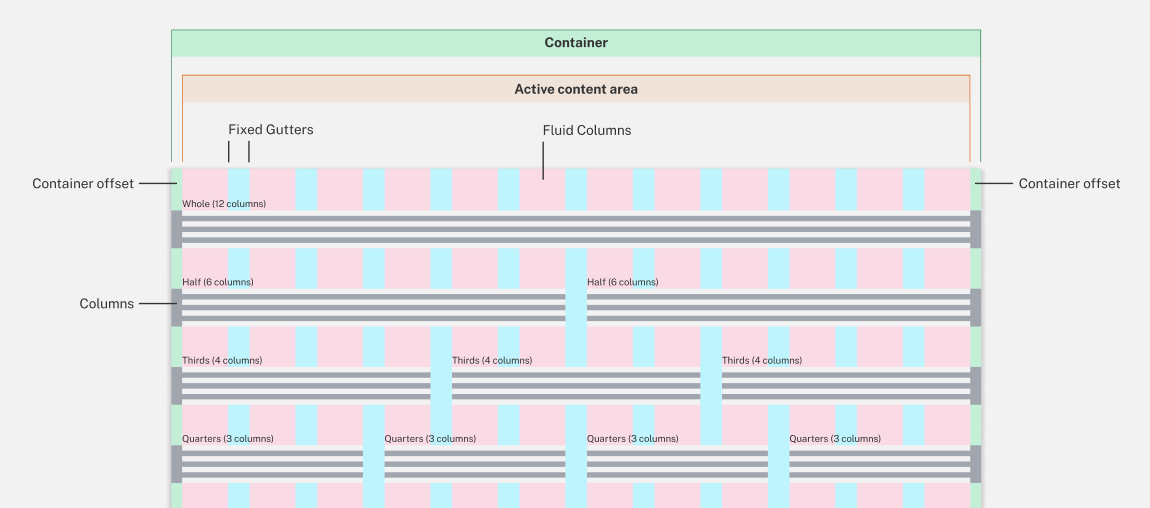
Whole
Show code Hide code
Half
Show code Hide code
Third
Show code Hide code
Quarter
Show code Hide code
Offset grids
Use nsw-offset-lg-* to shift the column to the right to the number of columns specified. For example, a nsw-offset-lg-3 class will have a 3-column gap between the previous column.
Show code Hide code