File upload
File uploaders help users to select and upload files.
Usage
Use file upload when a user is required to upload a file from their device to a specific location. Only ask users to upload files when it's critical to the delivery of your service.
Do:
- Use help text to highlight any input restrictions to the users upfront, for example format or size
- Allow multiple file formats as not everyone has access to the same software
- Be considerate of asking for large files, as some users may have limited band width or data
- Let users know exactly what errors occurred during an upload process so they can fix them
When to avoid
Avoid asking users to provide documents if you don't require them. Be considerate of file size and don't ask users to upload large files.
How this component works
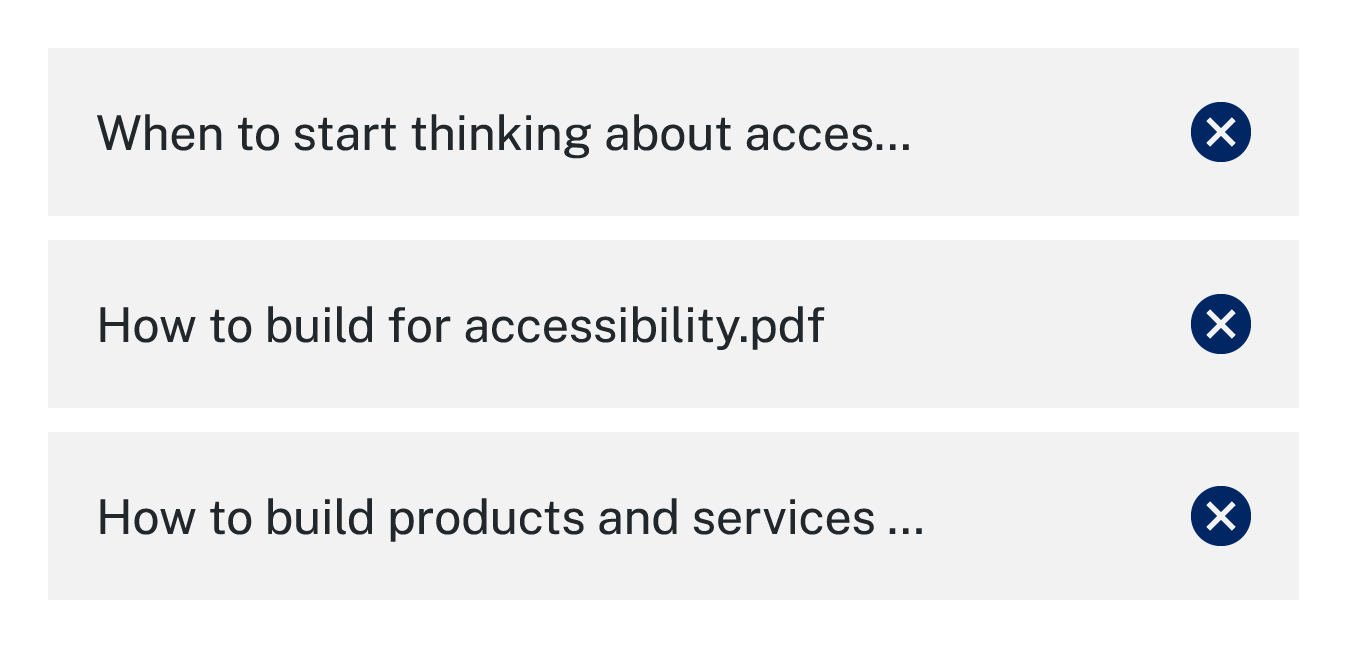
Truncate file names
Truncate file names when they extend beyond the width of the parent element
Upload status
This functionailty is not included in the base component.
Where a user would benefit from knowing the status of their upload consider adding indicators.

A loader can show the process is pending.

A tick can show the process is complete.
Multiple uploads
To enable multiple file uploads, add the multiple attribute to the file input.
To replace existing files instead of appending new ones, use the data-replace-files attribute on the file upload container.
Do not use both attributes simultaneously, as they conflict. Enabling both will cause unintended behaviour.
Clearly communicate if a user can upload multiple files and consider displaying additional files vertically.

Clearly group the files and allow users to remove each individually.
Error messages
Error messages inform the user when there is an issue with the data they have input. Provide helpful error messages to clearly explain to the user what the issue is and how they can effectively address the errors. Check out GOV.UK Design System's error messages for file uploads for some best practice examples.
Accessibility
All components are responsive and designed to comply with WCAG 2.2 AA accessibility standards. Full compliance depends on using and configuring the components correctly.
Ensuring compliance through usage
Redundant entry
To ensure WCAG 2.2 AA compliance for a file upload input, proper usage and configuration are essential. While the component provides a base level of accessibility, it's crucial to minimise redundant entry by configuring it so that users don't need to re-upload files or re-enter information they've previously provided. This includes allowing error correction without requiring re-entry and ensuring files remain accessible for review in multi-upload scenarios.
Consistent help
To create a consistent and accessible experience with the file upload component, provide clear, actionable guidance to support user interactions. Label the file upload field accurately, and include brief instructions on requirements like accepted file types or size limits, so users know exactly how to proceed. Use consistent language and formatting across all file upload interactions, ensuring users can easily recognise and understand the process.
Adhering to these practices in usage supports a smooth, accessible experience and meets the necessary compliance standards.
Error messages
Includes ability to accept only a single file.
File size must not exceed 350MB
Error messages
Includes ability to accept multiple files.
File size must not exceed 350MB The selected file must be smaller than 350MB