Inactive fields
Avoid using inactive form fields. Render fields only when users can edit them, and present read-only information as plain text.
Principles
- Show, don’t suggest. Present fixed values as text, not as inputs styled to look inactive.
- Reduce friction. Keep the tab order clean and efficient by removing controls the user cannot act on.
- Signal clearly. Make state obvious through wording, placement, and visual design—not through disabled or inactive controls.
Preferred patterns
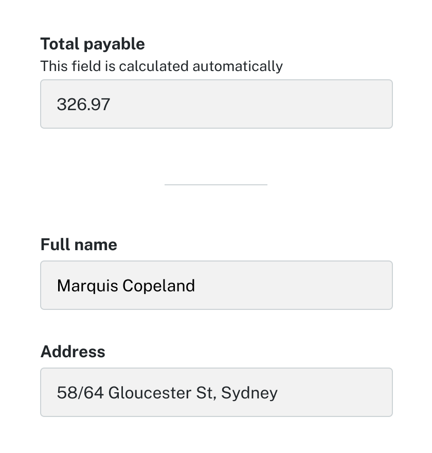
Display information as text
The simplest and most inclusive way to present information that cannot be edited is to show it as plain text near the related form. This avoids users mistaking an inactive input for something interactive. It also reduces visual clutter, keeps the focus order clean, and shortens the journey for keyboard and screen reader users. Showing data as text makes the status unambiguous: the user can read it, but they are not expected to act on it here.
Show read-only values as plain text (or in a summary list), and avoid long forms filled with non-editable inputs.
Examples:

Conditionally render relevant fields rather than toggling disabled attributes
Rather than use inactive fields for fields that aren't able to be updated by the user, conditionally render the field only when it's needed, rather than showing an inactive input with a disabled attribute.
Render fields only when they're relevant (rather than showing an inactive input with a disabled attribute) and offer a single, clear Edit action for the section; don’t use disabled fields to explain process states or permissions, or pad forms with non-editable inputs.
Example:
Before selection

After selection

Accessibility guidance
- Focus order: Presenting fixed values as text keeps the tab sequence clean and efficient.
- Announcements: Text is announced consistently across screen readers, avoiding the variability of input fields.
Content design
- Be explicit: State clearly why a value cannot be edited, for example “This information is set by your organisation”.
- Context placement: Display fixed values close to the related inputs, but outside the form controls.
- Explain how to change: Provide helper text if the value must be updated elsewhere, e.g. “Contact support to update your legal name”.
- Use consistent status wording: Keep short, scannable tags like “Verified”, “Pending”, or “Not provided”.
- One clear action: Offer a single, obvious “Edit” action for the section instead of multiple links.
- Render conditionally: Only render fields when relevant; never show inactive or non-editable inputs.